We’ll admit it - we got a little complacent with our website. So while we're not rebranding to Cirrusly (seriously though, happy April 1st! 😂), you will notice some big changes on the site! Below is the story of why these changes were necessary, how we were able to turn the site around, and a few simple steps to take for those who — like us — realize that modern businesses can’t rely on an amazing product alone.
First, some backstory.
We’ll start at the very beginning: Eight years ago, we built Breezy HR to help small businesses and startups leave the mess and stress of disorganized hiring behind. Our original goal hasn’t changed — we aim to make complex applicant tracking spreadsheets, cluttered inboxes, missing documentation, biased hiring and the looooong delays for candidates a thing of the past. With Breezy, teams can organize, automate, and improve their entire hiring process.
Of course, big companies have always had dozens and dozens of recruiting software options that try to soothe their hiring headaches — we should know, some of us have worked with those options, both inside and out! But they always felt so complicated for the average, non-HR professional user. Like there was this big wall of verbiage and tech and cost between a normal person who needed to hire and actually hiring.
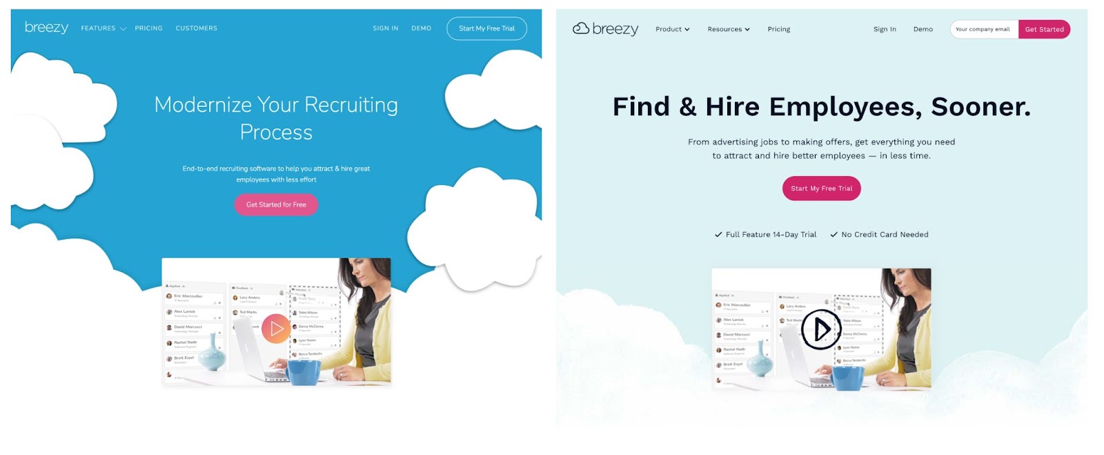
So we fit Breezy to the challenges these SMBs and startups faced, and all these years later, Breezy’s matured into the most user-friendly, best ROI ATS on the market. The problem? Our marketing site did not reflect that evolution.
What followed was an overdue website redesign with a focus on accessibility and ease for every user, and on communicating Breezy’s evolving feature set with clarity, honesty, and a dash of delight.
We sat down with Sarah Darr, Breezy HR’s Creative Director, to better understand how, and why, she tackled the website redesign process.
You started at Breezy four years ago - what did you think of the website then?
Sarah:
The existing website was vibrant and colorful which played well into Breezy’s fun vibe. It had all the information a website is supposed to have. It did its job by letting our target audience know exactly how Breezy could be a “Breath of Fresh HR” for them.
That site served us well for a long time - it was our launching pad, and we wouldn’t be where we are today, as a team or as a product, if we hadn’t started with it where we did: easygoing, everyday language and features for teams new to the hiring process (or just sick of the old hiring process).
So what made you want to start a website redesign process?
Sarah:
Well, over time — somewhere around eight years — the site had become a little unwieldy, both in terms of user experience and for our internal team. Like a cozy old house that ends up being swallowed by additions and quick renovations over the decades, the Breezy site was beginning to feel dated and confusing.
I knew I could bring the site's chaos under control in a way that could better reflect our product and our values, better reach potential customers, and better serve the amazing team behind Breezy.
Basically, our brand and company had evolved and our website needed to keep up.
Our style, now, is more reflective of the kind of upbeat conversational and visual language that connects with readers.
It’s also really important to me to meet or exceed the quality standards considered best practice in the HR community as a whole — I’m very conscious of sticking to language directives that show respect for individual readers from all walks of life.
And finally, I want as many readers and users with disabilities as possible to be able to experience our site in a way that’s comfortable for them, so I keep content accessibility guidelines and inclusivity high on my list of site design priorities.
Tell me about a few of your favorite examples of achieving those redesign goals.
Sarah:
Sure, there are so many! This was a big overhaul of our site and brand. I am so happy with how it turned out and how it now reflects on Breezy as a whole.
- One of the big changes we made in terms of website accessibility was incorporating new color contrast guidelines and new font size guidelines to make sure that all text is easily legible on our site. This doesn’t just help readers with visual impairments, it makes every web page more enjoyable to read for anyone.
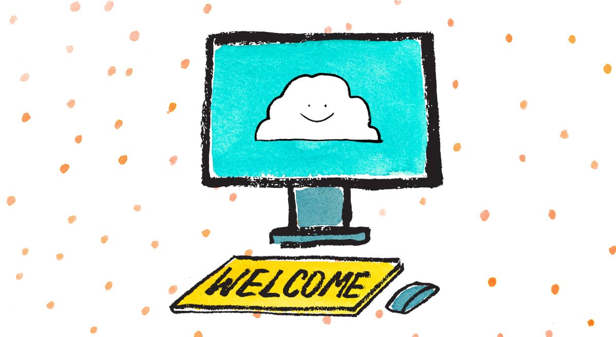
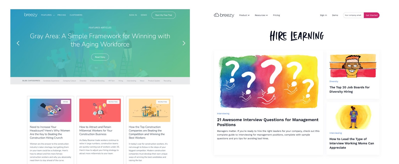
- On the branding side, we started incorporating custom artwork into all of our content and it has really expanded the meaning of our brand in a big way. These visual elements introduce a fun and humorous side to the hiring and HR processes that can otherwise feel really boring, at best … or intimidating, at worst.
How could others get started on making their brands/sites more accessible to people with disabilities?
Sarah:
This is so easy! Start by putting yourself in others' shoes.
I love the Tool from Idean called Cards for Humanity. It allows you to design and create accessible sites with inclusivity kind of built in. Thinking about how someone else might see your site or design will open you up to so many possibilities and can make your work even better.
I would also say, take it one step at a time. Start with a small change, and when you realize that meeting an accessibility standard raises the bar for your site, you’re going to want to keep building on that progress.
Any final thoughts on the website redesign strategy? Or the finished product ?
Haha, I don’t think of this site as the finished product — it’s not the final final, if you know what I mean. Like Breezy itself, the website content will continue to evolve to reflect new features and fresh thinking. But my priorities will stay the same: clear, accessible and honest design … with a heavy dose of charm thrown in.


